Presentation Notes
Closing the Circuit: Building Accessible Modules from the Ground Up
Marsha Allen, CTRS, Web Developer
Center for Assistive Technology & Environmental Access (CATEA)
Georgia Institute of Technology
Phone: 404-894-4960 (v/tty)
Fax: 404-894-9320
Email: marsha.allen@coa.gatech.edu
Objectives
- Identify 3 barriers for users with disabilities.
- Describe the 5-step process for creating an accessible online training program.
- Discuss tools and solutions to improve usability and integrate accessibility in design.
Presentation Handouts:
Closing the Circuit: Building Accessible Modules from the Ground Up
www.catea.org/grade/training/
But first a word from our sponsors …
(CATEA) Georgia Tech Center for Assistive Technology and Environmental Access www. catea.org/
- Training, research, information, and technical assistance on disability-related issues and design.
- National public AT website: assistivetech.net
- Mobility Rehabilitation Engineering Research Center: mobilityrerc.catea.org
- Workplace Rehabilitation Engineering Research Center: workrerc.org
(GRADE) Georgia Tech Research on Accessible Distance Education catea.org/grade
- Fact sheets & technical assistance
- Accessible course models
- Guidelines for accessible online materials
- Accesselearning.net: 10 module online tutorial on making distance ed accessible
(ITTATC) Information Technology Technical Assistance and Training Center www.ittatc.org
Section 508 and 255 Information, Training, Technical Assistance
Toll free: 866-9ITTATC or 866-948-8282 (voice/tty)
ADA & Accessible Information Technology Centers
- 10 Regional U.S. Centers with current "key" initiatives:
- Reasonable accommodation
- K-12 Breaking Down Barriers
- Post-secondary web accessibility evaluation & training
Contact Your Regional ADA & IT Center : 800-949-4232 (v/tty) www.adata.org
Module: Federal Court Concepts
- Public website in HTML at www.catea.org/grade/legal/.
- 12 webpages of basic information on:
- Structure of the federal courts.
- Kind of cases that federal courts hear.
- How to use federal court decisions in research.
Module Design: Federal Court Concepts
- Designed from start with accessibility in mind.
- Created to showcase best practices of accessible design from GRADE research.
- Uses common components such as images, PowerPoint slides, Excel charts, web links, PDF file.
Module Listed In …
- National Council for Social Studies website.
- Federal Resources for Educational Excellence.
- Georgia Department of Education for Georgia civics and government educators.
- Education World with A+ rating of Federal Courts module
- MERLOT: Multimedia Educational Resource for Learning and Online Teaching (www.merlot.org)
Accessibility Guidelines for Distance Learning
Developed by:GRADE Project and MERLOT
- Format: Must, Should, May
- PDF Files
- Excel Documents
- Flash Applications
- PowerPoint Files
- Video and Media
- Word Documents
www.catea.org/grade/guides/introduction.php
Five Phases to Create Accessible Module
- Framework
- Content Development
- Design: Template and CSS
- Supplemental Files in Accessible Formats
- Usability Testing
- Paper: Closing the Circuit: Accessibility from Ground Up www.sedbtac.org/ed/edpublications/index.php?id=114
Phase 1: Framework – 6 Questions
Answer 6 Questions? (Who?, What?, Why?, Where?,When?, and How?) around Goals & Objectives
Phase 1: Framework – Module Goals
- Training tool for Southeast DBTAC affiliates, especially new ADA caselaw.
- Use in high school or post-secondary courses on civics or introductory political science.
- Example of accessible, attractive, usable module design process.
- Putting research into practice.
Phase 1: Framework – Why?
- Do "lit review" to determine if need or reinvention of wheel.
- Found 5 modules with similar content, but:
- All had access issues for individuals with disabilities.
- None presented all relevant information in an easily understood manner.
Phase 1: Framework - Who?
- Content: Subject Matter Expert - Curtis Edmonds, J.D.
- Some experience designing web content helpful.
- Support: Web or Instructional Designer - Marsha Allen, Web Developer
- Support for design and 2nd eyes to evaluate content; have some familiarity with accessibility.
Phase 1: Framework - When?
- Timeline for development and launching, including testing and editing.
- Module developed over a month.
- Commitments to other projects caused development on "ad hoc" piecemeal basis.
Phase 1: Framework - How?
- Compliance to web access laws, standards, principles.
- Federal Law
- Section 504 of the Rehabilitation Act
- Americans with Disabilities Act
- Section 508 of the Rehabilitation Act
- State Laws Database from ITTATC Project (www.ittatc.org/laws/state_prototype.php)
- Standards and Guidelines
- W3C Web Content Accessibility Guidelines
- IMS Guidelines for Accessible Learning Applications (www.imsglobal.org/accessibility/accessiblevers/)
Section 504 of the Rehabilitation Act of 1973
- All public or private institutions receiving federal funding, must make programs and services accessible for individuals with disabilities.
- Enforcing agency: Office for Civil Rights (OCR)
- OCR has ruled …
- Not whether student with disability is provided access, but extent that communication is actually as effective as that provided to others.
- In favor of making information technology (IT) accessible for students with disabilities.
Americans with Disabilities Act of 1990
- Passed 1990 before Internet.
- Disability if meet one of three-part definition.
- Title II "Effective communication" applies to Internet per Department of Justice.
- ADA Basic Building Blocks webcourse www.adabasics.org
Section 508 of the Rehabilitation Act
- Federal departments must:
- Accommodate employees with disabilities.
- Design accessible websites.
- Procure accessible information technology.
www.section508.gov
Web Content Accessibility Guidelines (WCAG)
- World Wide Web Consortium (W3C)
- 1.0 current; 2.0 due this year - www.w3c.org/WAI
- 3 voluntary compliance levels
![]() A- Level 1 AA – Level 2 AAA – Level 3
A- Level 1 AA – Level 2 AAA – Level 3 ![]()
Section 508 to ADA and WCAG
- If 508 adopted as policy:
- For ADA: likely demonstrate compliance with "communication" requirements.
- For W3C WCAG: likely meet minimum Level A, Priority 1 of which 508 was based.
Universal Design (UD)
- Design of products, environments, and communications to be usable by all people, to the greatest extent possible, without need for adaptation or specialized design.
Design for All, Inclusive Design, Lifespan Design
Guiding Principal: Usability
- Designing a user interface that is: Effective, Efficient, and Satisfying.
Source: Understanding Web Accessibility, S. Henry
Integrating Accessibility, Usability, and UD
"Built-in design that makes the learning goals achievable by individuals with wide differences in their abilities to see, hear, speak, move, read, write, understand English, attend, organize, engage, and remember." Source: Council for Exceptional Children (CEC)
"A strict focus on accessibility as a scorecard item doesn't help users with disabilities. To help these users accomplish critical tasks, you must adopt a usability perspective. "
Source: Jakob Nielsen, Alertbox, Nov. 21, 2005, www.useit.com/alertbox/accessibility.html
Phase 2: Content Development
- Foundation on which design is built using common HTML tags to id structure. i.e. headings, list, link, etc.
- Develop in Word, PowerPoint, or WYSIWYG authoring tool
- HTML Kit www.chami.com/html-kit/
- Macromedia Dreamweaver MX
- Make links distinct and identify language.
- Provide alt-text for any images.
Readability, Context, and Alternate Format
- Aoccdrnig to a rscheearchr at Cmabrigde Uinervtisy, it deosn't mttaer in waht oredr the ltteers in a wrod are, the olny iprmoetnt tihng is taht the frist and lsat ltteer be at the rghit pclae. The rset can be a tatol mses and you can sitll raed it wouthit porbeslm. Tihs is bcuseae the huamn mnid deos not raed ervey lteter by istlef, but the wrod as a wlohe. Amzanig huh!
How are these seats different?
- … In the mark-up. Same applies to UNIVERSAL DESIGN of web sites.
Behind the Scenes of a Web Page
- Foundation on which design is built. HyperText Markup Language (HTML)
- <Tags> create "behind the scenes" framework and identify elements i.e. headings, lists, links, paragraphs
- Develop in text editor (i.e. NotePad), Word program, web authoring tool, or "cut-n-paste" between both.
Framework <Tags> of HTML Webpage 
<html>
<head>
<title>Name for Document</title>
</head>
<body>
Content goes here
</body>
</html>
Handout: www.sedbtac.org/ed/training/webaccess/CommonHTML.doc
Common <Tags> in HTML
<p> = paragraph
<ul> = unordered list (bulleted)
<ol> = ordered list
<li>= list item
<a> = link
<h1>,<h2>,<h3>, <h4>,<h5>, <h6> = headings big à small
Handout: www.sedbtac.org/ed/training/webaccess/CommonHTML.htm
WYSIWYG Authoring Tools
- Many tools create "bad" or "junky" code. i.e. Frontpage, "Save As Webpage".
- Other tools build-in or prompt "good" code. i.e. Dreamweaver MX (Edit > Preferences > Accessibility)
Use Valid Markup (Code)
- Common error… deprecated code. Change <b> to <strong> and <i> to <em>.
- Check using tools:
- W3C Markup Validator http://validator.w3.org/
- WAVE validation tool http://wave.webaim.org
- "Shift + F7" in Dreamweaver
Writing for Web
- Different than paper; each page independent.
- Concise, "quick-to-read" chunks.
- Hierarchical content organization.
- Use standard fonts and sans-serif vs. serifs. i.e. Arial, Verdana, Tahoma
- Provide alternate formats.
- Large print: minimum 18 pt.; preferred 22 pt.
K.I.S.S. Principle
- Use the clearest and simplest language appropriate for a site's content.
- Keep it simple and standard.
Identify Language
- Enables proper reading by text-to-speech and screenreader technology.
- Solution - use "lang" attribute:
- Use with <html> tag to apply to whole document <html lang="en">
- Use with any tag to identify language changes
<p lang="es">Hola! Mi amigos!</p>
- Use with <span> tag to apply to an instance
<p>Spanish for hello: <span lang="es">Hola!</span></p>
Hearing is Seeing …
- Screenreaders
- Get
- Information
- One
- Word
- At
- A
- Time
- And By Viewing Links Or Headings In A Page.
- Click here
- Click here
- Document
- Here
- Download
Links: Distinct, Inform, Stand-Alone
- Provide distinct link that cues reader and makes sense if read alone (list of links).
- Identify file type and size if link to non-web item. i.e. My File (
 , 30 KB).
 - Inform user if opening a new window.

- Offer link to software needed for non-web items.
- Separate adjacent links with printable, spaced characters to improve readability and target area.
Testing Links
- Use validation tool:
- WAVE validation tool http://wave.webaim.org/
i.e. click here ![]() *Link uninformative*
*Link uninformative*
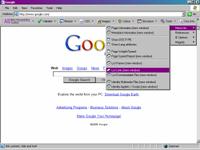
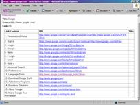
- Links list using AIS web accessibility toolbar:
- Doc Info > Meta Info > List Links i.e. www.google.com
Images
- Alternative-text (alt-text) #1 solution
- If alt-text provided, typically displays when a user places a pointing device, such as the mouse cursor, over an image.
- Provide short, equivalent information by context
- For example, the alt-text for the logo of the Federal Court Concepts module (www.catea.org/grade/legal) should be: "Federal Court Concepts."
Practice Exercise for Images
Select the best "alt-text" for sample image:
- Mailbox
- Letter entering mailbox
- Mailing address

Answer: Choice #3 or #1 are best answers because these more inform the user about the context of the image in relation to its adjacent text.
No alt-text = no understanding
- Without alt-text, the filename of image or embedded type of file is displayed
- i.e. kwajex.gif or [inline][inline][inline][link][inline]
Code for alt-text of an Image
<img src="filename, i.e. logo.gif"
border="0"
height="whole number of image height, i.e. 150"
width="whole number of image width, i.e. 200"
alt="short, equal description, i.e. Federal Court Concepts">
- Code example for the logo of the Federal Court Concepts module (www.catea.org/grade/legal)
Null/Empty/Blank alt-text for Images
- Describing decorative, spacer, or bullet images, and repeating adjacent text annoys and confuses users.
Bad: no alt-text alt="right green corner"
alt="Arrow On" alt="Bullet"
alt="Information" Information
- Leave "empty" for voice-enabled technology to ignore and not display in text browsers.
Good: alt="" alt = "" Information
Length of alt-text for Images
- Holds 255 characters but maximum of 150 characters allowed by some browsers.
- But, what if highly detailed like a logo or collage?
Long Description for Images
- Use "longdesc" attribute of image tag <img> for detailed images or graphs.
- Goes to another webpage describing details of the image.
<img src="structure.gif" border="0" height="150" width="200" alt="Federal Court Concepts" longdesc="logodescription.htm">
- Code example for the logo of the Federal Court Concepts module (www.catea.org/grade/legal)
Additonal Ways For Long Description
- Increasing support for "longdesc" by assistive technology.
- Benefits users with cognitive disabilities, different learning styles or language.
- Use a "d-link", i.e. Federal Court Concepts catea.org/grade/legal/index.html
Note: The d-link is now deprecated; share so familiar if encounter.
- Link around image to another web page with description, i.e. assistivetech.net
- Caption below image, i.e. Design Lifespan Course catea.org/grade/lifespan/
- Describe math and science equations by case and position. i.e. Fluid Mechanics Course
catea.org/grade/mecheng/mehome.htm
Images in Dreamweaver
- Prompt to enter alternate text and long description (link to another page).

Decorative Images in Dreamweaver
- Select "empty" if image decorative, bullet, or spacer.

Testing Images for alt-text
- Listen with a screenreader.
- Use validation tool: WAVE validation tool http://wave.webaim.org/
 no alt-text
  alt-text
 null alt-text
- View in text-only browser:
- Lynx Text View tool www.yellowpipe.com/yis/tools/lynx/lynx_viewer.php
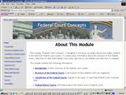
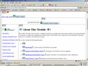
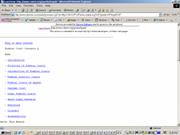
- Code example for the logo of the Federal Court Concepts module (www.catea.org/grade/legal)
- Use AIS web accessibility toolbar for testing images:
- Images > Toggle Alt, Image List, Show Images
- Tools > Simulations > Lynx Viewer
Phase 3: Template and Style Sheet
- Develop consistent, logical, color contrasted template design of module.
- Create a cascading style sheet (css).
- Insert skip-navigation link.
- Test and correct as needed for accessibility.
Benefits of Template and CSS
- Ensures all pages consistent look and feel.
- Saves time in coding and editing.
- Resolves most accessibility and usability issues ahead of time.
- Results in faster download.
Phase 3 Template and CSS
A. Template Design of Module (www.sedbtac.org/ed/training/webaccess/TemplateCode2.htm)
- Includes header, footer, navigation areas.
- Use copyright-free images from government websites, create new, or get permission/credit source.
- Provide alt-text for any images.
- Template Code of Module
 (www.sedbtac.org/ed/training/webaccess/TemplateCode2.doc)
Interface Design
- Consistent, logical from page to page.
- Use "expected" conventions.
- Larger buttons and icons.
- Avoid excessive use of graphics.
- Last resort make a text-only page.
Navigation Design
- Avoid JavaScript or Flash for menus.
- Give reasonable time and alert if timed.
- Consistent, logical, ready-placement.
- Site map, search and contact / help information.
- Provide accessibility and site features information.
More Than Color
- Use to highlight focus, increase aesthetic appeal.
- Ensure color alone is not required.
Bad: Information in red is required.
Push the green button to start.
Good: *Required information in red with asterisk.
Table using color to show legal citation parts (www.catea.org/grade/legal/research.html)

Use high contrast between text and background.

Avoid distracting and watermark backgrounds
Read this text against a highly-colored psychedelic background

Test Color and Contrast
- Print black and white.
- View in gray-scale.
- Use Hermish validation tool to check contrast. (www.hermish.com/check_access.php)
- Use AIS Web Accessibility Toolbar
- Tools > Simulations > choose various visual disabilities
- Color > Greyscale, Contrast Analyzer, Vischeck
- Use Vischeck Color Blindness tool. (www.vischeck.com)

Red/Green Color Blind
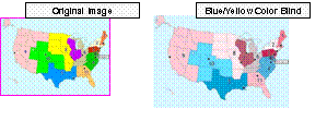
Phase 3 Template and CSS
B. Create a cascading style sheet (css)
- Separate document associated with a webpage that provides users with flexibility in viewing.
- Holds the look and feel of the webpage separate from the content.
Why use a cascading style sheet (css)?
- Standards require.
- Flexible to smaller screen; minimizes or eliminates scrolling and cut-off.
- Allows flexibility in user viewing (color,size,font).
- Easier, cheaper to make changes to design and formatting for all webpages .
Examples of cascading style sheet in action
- CSS Zen Garden www.csszengarden.com
- Federal Court Concept (alt viewing) www.catea.org/grade/legal/accessibility2.html
Example of CSS styles
- All paragraphs large-print, red in Futura font on a white background:
p {font-size: 200%; color: #cc0033; font-family:Futura Extra Bold; background-color: #ffffff; }
- Create own style for "noted" text centered and black in bold print on a gray background.
.notetext { text-align:center; color: #000000; font-weight: bold; background-color: #efefef;}
Handout: www.sedbtac.org/ed/training/webaccess/default2.css
Applying css to web page 
- Link to external css file between "head" tags:
<head><link href="my_style_sheet.css" rel="stylesheet" type="text/css"></head> .
- For HTML tags, no additional coding to apply style.
- To apply own styles, use class with tag, span, or div:
<p class="notetext">
<span class="notetext">
<div class="notetext">
Handout: www.sedbtac.org/ed/training/webaccess/SampleContent_CSS.doc
Testing Cascading Style Sheet
- View without style sheets by:
- "Turning-off" style sheet in browser.
- Use text-only browser.
- Use W3C CSS Validator to check code. http://jigsaw.w3.org/css-validator/
Phase 3: Template and CSS
C. Create a Skip-Navigation Link
- Permits users to skip repetitive navigation links.
- Supports keyboard-only access and logical tab order to navigate information.
- Specifically required by Section 508.
Code for Skip-Navigation Link
- Create link as first element after starting <body> tag in HTML file.
<a href="#top">Skip to Page Content</a>
- Put "anchor" just before content to be accessed.
<a name="#top"></a><h1>Page Title</h1>
- Examples:
- How skip-nav works: www.catea.org/grade/legal/
- Skip-nav display using css: www.adagame.org/
Testing Code of Template
- Validate code (or markup) using tool:
- W3C Markup Validator http://validator.w3.org/
- "Shift + F7" in Dreamweaver
- Common error… deprecated code:
- Remove bgcolor attribute and <font> tag; handle in style sheet.
Test to Accessibility Standards
- Catch the WAVE Validation Tool:
http://wave.webaim.org/index.jsp
- Don't Be Hermish validation tool
www.hermish.com/check_access.php
www.nils.org.au/ais/
http://www.w3c.org/WAI/ER/existingtools.html
Phase 4: Supplemental Files in Accessible Formats


 Barriers exist beyond the web:
- Avoid built-in "Save as Webpage" = JUNKY!
- Multiple columns.
- Lack of structure which AT relies upon.
- Lack of textual equivalent for images, media.
- Lack of software to view the document.
Tables
- Can be difficult for AT to navigate unless properly structured or text alternative provided.
- Table Example: Jurisdiction of the Federal Courts www.catea.org/grade/legal/juris.html
Reading Order of Tables
Screen |
readers |
read |
information |
across |
tables |
in a |
linear |
way |
thereby |
making |
it |
difficult |
to |
understand |
information |
contained |
in tables. |
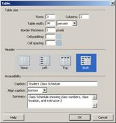
Tables in Dreamweaver: Caption, Summary
- Prompts to provide caption, summary, and location of headers.
Tables in Dreamweaver: Table Headers
- Automatically creates table headers for selected cells when "header" checked in its Properties panel.

Testing Tables
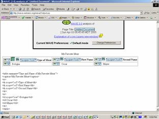
- Use a validation tool: WAVE wave.webaim.org/
- View in text browser: Lynx Viewer www.yellowpipe.com/yis/tools/lynx/lynx_viewer.php
- Use screenreader or voice-enabled tool, i.e. IBM Home Page Reader.
- Run a piece of paper down the page and read table line by line.
Example of Table Testing using WAVE Validation Tool
Word Documents 
- Format with Styles drop-down box and tools.
- Build outline of document, which voice-enabled technologies rely upon.
- Promotes better readability for users and browsers.
- Improves conversion to accessible PDF file.
- Text descriptions for images and charts.
Excel Documents 
- Linearize or alternate format of tables.
- Text descriptions for images and charts.
- Excel Chart Example: Federal District Courts www.catea.org/grade/legal/district.html
- Requires long description of information presented in chart .
 PowerPoint Files
- PowerPoint Slide Example: Structure of the Federal Courts www.catea.org/grade/legal/structure.html
- Two diagrams with complex info (PowerPoint slides) need long descriptions.
- Illinois Accessible Web Publishing Wizard for Microsoft Office
- Converts Word, PowerPoint and Excel files to accessible, valid webpages with style sheet.
- Guided interface that automates most of the conversion.
- Adds "Save As Accessible Web Page" option under File menu of all Office applications.
http://cita.rehab.uiuc.edu/software/office/index.html
PDF Files
- Start with accessible Word document.
- Identify as PDF with file size in the link. i.e. MyFile (PDF, 13 KB)
- Give link to download Adobe Reader which need to view PDF files.
- Avoid scanning as creates one image; text cannot be accessed.
- Provide more accessible format.
Testing PDF Accessibility
- User-testing.
- Adobe Online Conversion Tools for PDF (online, text, or html).
www.adobe.com/products/acrobat/access_onlinetools.html
Phase 5: Usability Testing
- Ensure that users with and without disabilities can easilyuse the web site, or will be failure.
- Establish a clear, web usability and accessibility policy.
- More than just following and validating to a set of accessibility guidelines.
Accessibility is Good Usability
- What usable may be required for accessibility.
- Most accessibility increases usability for all.
- Font adjustable: Convenient and helps user with low vision.
- Keyboard shortcuts: Productivity and helps users unable to use mouse.
- "Hands-free" support: Helps mobile and web-enabled devices.
- Inclusion.
- Searchable for key words and phrases.
- Captioning helps language and learning.
- Compatibility across technology versions.
- More effective from start vs. scramble-fix.
Test Browsers and Operating Systems
- View in text-only browser, i.e. Lynx Viewer yellowpipe.com/yis/tools/lynx/lynx_viewer.php
- Use screenreader or speech output, i.e. IBM HPR www-306.ibm.com/able/dwnlds/index.html
- Navigate without a mouse (keyboard only).
- Check the load time.
Quick Usability Review
- What site is this?
- What page am I on?
- What are the major sections of this site?
- What are my options at this level?
- Where am I in the scheme of things?
- How can I search?
Results of Module Usability Testing
- Reinforce "Where am I?" by bolding text. www.catea.org/grade/legal/
- Develop alternative view for more flexibility. www.catea.org/grade/legal/accessibility2.html
- Add a glossary and link to instances in text. www.catea.org/grade/legal/glossary.html


![]()
Examples of Accessible Course Models
- Designing for the Life Span
- Introduction to Fluid Mechanics
- Scientific Perspectives on World Hunger Source: www.catea.org/grade/coursedesign.html
Accessible Course Model 1:

Background
- Undergraduate course in human factors design and engineering.
- Developed and taught on-site in Georgia Tech College of Architecture, Industrial Design program.
- Four segments of original classroom course.
Issues/Access Barriers
- Extensive PowerPoint slides, graphics, charts, tables and sound files that lacked text descriptions.
- Could not be accessed by students who were unable to see the visual content, or hear the audio.
Solutions for Accessibility
- Web-based version with:
- Logical, consistent navigation.
- Text descriptions for all PowerPoint slides, graphics, charts, and tables.
- Transcript for each sound file.
Accessible Course Model 2: Introduction to Fluid Mechanics
Background
- Graduate-level engineering course (ME6601) that covers:
- Fundamentals of fluid mechanics.
- Derivation of equations of motion.
- Introduction to viscous, inviscid, turbulent, and boundary-layer flows.
- Pre-requisite courses for broad range of engineering disciplines, such as mechanical, bio-engineering, aerospace, and civil engineering.
- Taught by Professor Paul Neitzel from Georgia Institute of Technology in Atlanta, Georgia.
Issues/Access Barriers
- Original distance-education course relied heavily on video that lacked captioning.
- Lacked text descriptions for images = unusable by users with low vision or blindness.
- Web pages difficult or impossible to navigate for users who could not see.
- Frequent use of mathematical equations, charts, images, visual representations and other files.
Solutions for Accessibility
- Web-based version for six modules of the course with:
- Logical, consistent navigation.
- Text descriptions for all PowerPoint slides, graphics, charts, and tables.
- Captioned videos with transcripts.
- Accessible Word file with descriptions and references for mathematical equations.
Accessible Design: On the Horizon
- Accessible Flash: Almost ready for prime time; works in some configurations now.
- Authoring Tools producing more accessible code.
- Assistive Technology (AT) compatibility improving.
- Course Management Systems(CMS) building in accessibility and AT compatibility.
Advocate Accessible Design
- Model accessible design.
- Cite legal, business, and effectiveness rationale.
- Share findings of usability review and tools that validate accessibility to encourage adjustments.
- Draft outline of why inaccessible websites and educational materials difficult to use.
- Collaborate and share resources.
Challenge To You …
- Redefine true accessibility to be a state of … UNIVERSAL DESIGN.
- Think outside of the box.
- There are no "cookie-cutter" approaches.
Questions and Comments?
Marsha Allen, Web Manager, CTRS marsha.allen@coa.gatech.edu
Center for AT & Environmental Access (CATEA)
Georgia Tech, College of Architecture,
490 Tenth Street, Atlanta, Georgia 30318
Fax: 404-894-9320
Phone: 404-894-4960 (v/tty)
Web: www.catea.org
