Accessibility Video “Playlist”

Video can often convey emotion and information more effectively than a static article. It can be an engaging way to start a presentation or to demonstrate a complex task. However, finding the best video for a certain topic can often be very time consuming (trust me!). While there are many great videos online, many of the videos on this topic present misinformation (e.g., the wrong way to add alternative text in MS Word) or are presented without captions themselves.

This post includes links to the most accurate, engaging, and accessible videos that I could find after hours of searching. Unless specified otherwise, videos are captioned and are found in YouTube.

Experiences of users with disabilities

People are far more inclined to make their content accessible once they realize how their design decisions can help real people with disabilities. If you only have time to share one video, make it a firsthand account from a user with a disability.

A Personal Look at Accessibility in Higher Education

Created by GOALS

Students and faculty with disabilities share their frustrations with inaccessible web content in higher ed as well as their optimism that things can improve.

Keeping Web Accessibility in Mind

Created by WebAIM

Three users with disabilities (blindness, quadriplegia, deafness) demonstrate their frustrations with inaccessible web content. The technology used is a bit dated, but the experiences are very relevant.

To Care and Comply

Created by

The first half of this video (especially the first minute) provides excellent examples of students and faculty with disabilities.

World Wide Access

Created by DO-IT

This is a fabulous resource for web developers and other more technical individuals. It explains the four principles of accessibility that form the foundation of the Web Content Accessibility Guidelines (WCAG) 2.0. It has dozens of examples of users with disabilities interacting with web pages, and uses audio descriptions, which may be new to some viewers.

How Blind People Use The iPhone 4S

Created by Tommy Edison

The always humorous Tommy Edison shows how he uses an iPhone. After watching this video, take a few minutes to watch one of his Blind Film Critic videos.

The importance of accessibility

While many people may think it is a noble goal, they may not be sold on the importance or value of accessible web design. These videos help outline why web accessibility is a smart, fiscally responsible decision.

Web Accessibility

Created by FaHCSIA (the Australian Government Department of Families, Housing, Community Services and Indigenous Affairs)

An engaging, jazzy (maybe too jazzy) introduction to web accessibility. While the references and statistics refer to Australia, the principles are universal.

IT Accessibility: What Campus Leaders Have to Say

Created by DO-IT

While a bit long, this video provides a very compelling case for accessibility from Administrators in higher education. If you are struggling to win over administrators at your institution, this is a must-watch.

Creating accessible content

I had a great deal of difficulty finding tutorial videos that were accurate as well as timely.

Accessible Documents in MS Office (no captions)

Created by Microsoft Office

Although this video is not captioned, it was the most accurate and up to date video I could find. Many of the best videos for creating accessible content are provided by the company itself.

Create Accessible PDF Files in Acrobat XI (Adobe site)

Created by Adobe

A brief overview of how to use the “Make Accessible” wizard in Adobe XI. Adobe has an excellent “Accessibility Channel” for many of their tools. Unfortunately, not all of these videos are captioned.

Caption Fail

Created by Rhett and Link (no captions)

Do you know someone who thinks that YouTube’s “Automatic Captions” are the answer to their captioning problems? Show them this humorous video. Ironically, I was unable to find a good video on captioning YouTube videos.

What’s on your playlist?

Is there a video that you regularly use that isn’t on this list? Please share it below.

Looking to the Work of Others as You Create Your Institution’s Web Accessibility Policy

I for one never want to reinvent the wheel. Whenever I am tasked to create something, I always begin by looking at what others have done so that I may learn from their efforts to inform my thinking. Creating an institution-wide web accessibility policy is an enormous task that requires contemplation along many institutional dimensions and also along several policy components. In the GOALS Recommended Practice Indicators we outline what we view as necessary components to go into a policy document. While these components are described in greater detail on our website, they are comprised of the following brief elements:

  • Summary statement(s) of the policy
  • Effective date(s) for the policy
  • The scope of the policy
  • The technical standard used in the policy
  • A provision for procurement
  • The consequences if units or individuals choose non-conformance
  • A mechanism for ongoing review

It is important to remember that the policy document is separate from the institution’s written implementation plan. However finding models that have been used successfully can be a treasure trove if you are looking to create either (policy or plan) for your institution. Unfortunately, identifying good examples of policies that contain the components you may want to use, or even full policies in use, can be difficult and time consuming.

In the spirit of helping your efforts to create a web accessibility policy at your institution, the following resource sheet provides examples that may be helpful. Please remember as you look through these links that your institution may already have a template of sorts you must use for policy creation. Also, please know that there are many other excellent policies out there, so if you know of some good models, or you would like to share yours, please add it to the comments below.

Examples and suggestions for policy creation

Additional resources

Review of recent legal issues in higher education and web accessibility

I am not an attorney, or in any way associated with a legal profession. I am however an advocate for those who wish to make the digital world an accessible space, especially in higher education. Because of this, I endeavor to stay connected with the broader struggle facing higher education as legal demands for digital accessibility sweep the landscape.

I have found that if you are not following this aspect of web accessibility it is easy to lose sight of the momentum that is building rapidly. With that in mind, I thought it might be helpful to briefly review what has been happening in the recent past. What I share below are thumbnail sketches of legal complaints and resolutions that affect web accessibility in higher education since 2009. If I have missed anything and you have other complaints or resolutions to share, please add your comments below. I am hopeful that this can be useful to those trying to find this content in one place.

(Feb) 2009- Law School Admissions Council

The National Federation of the Blind (NFB) filed a complaint against the LSAC (Law School Admissions Council) under the Disabled Persons Act, California Civil Code &#167&#167 54 et seq., and the Unruh Civil Rights Act, California Civil Code §§ 51 et seq for inaccessible web content and LSAT preparation materials. Law schools across the nation use the LSAC web portal as a mechanism for students to apply for admission to law school. The California plaintiffs complained that the inaccessibility of the Pennsylvania-based website portal complicated their ability to apply for law school and denied them their rights under ADA Titles II and III. The April 2011 settlement included an agreement to make web content and services conform to WCAG 2.0 AA within 5 months (by September of 2011).

This suit had a collateral effect as NFB filed complaints with the Department of Justice against institutions that use the inaccessible LSAC process as their primary means of admissions. This happened over several months during the Spring of 2010. NFB argued that this practice violated Title III of the ADA. These schools included:

  1. Atlanta’s John Marshall Law School
  2. Cardozo School of Law
  3. Chapman University School of Law
  4. University of Chicago School of Law
  5. University of Denver
  6. Gonzaga University School of Law
  7. Lee University School of Law
  8. Northeastern University School of Law
  9. Sturm College of Law
  10. Thomas Jefferson School of Law
  11. University of California Hastings College of the Law
  12. University of Miami School of Law
  13. Washington School of Law
  14. William Mitchell College of Law
  15. Whittier College Law School
  16. Yeshiva University

Settlements with institutions (e.g., See the John Marshall settlement) included an institutional requirement to notify students that the LSAC application process is not accessible and to stop using LSAC if accessibility agreements were not met by LSAC on the approved timeline. Also, schools are to fully consider applications that do not come through the LSAC process.

(June) 2009- Kindle DX

Both the National Federation of the Blind (NFB) and the American Council of the Blind (ACB) filed a discrimination complaint against Arizona State University for using inaccessible technologies (i.e., Kindle DX). Other institutions were drawn into this complaint. Namely Case Western Reserve University in Cleveland, Pace University in New York City and Reed College in Portland, Ore. These complaints were settled in January of 2010 and those institutions agreed not to use emerging technologies that were not accessible.

However the dispute created a clarion call from the U.S. government to leadership in higher education. The Executive branch (i.e., the White House) sent a letter to every college and university president across the nation on the important issue of digital accessibility. This letter, written jointly by the Departments of Justice and Education and indicated:

Technology is the hallmark of the future, and technological competency is essential to preparing all students for future success. Emerging technologies are an educational resource that enhances learning for everyone, and perhaps especially for students with disabilities. Technological innovations have opened a virtual world of commerce, information, and education to many individuals with disabilities for whom access to the physical world remains challenging. Ensuring equal access to emerging technology in university and college classrooms is a means to the goal of full integration and equal educational opportunity for this nation’s students with disabilities…

The letter further admonished decision-makers in higher education by concluding; “It is unacceptable for universities to use emerging technology without insisting that this technology be accessible to all students.”

(Nov) 2010- Penn State

The NFB filed a complaint against Penn State University stating that the institution violated the rights of both students and faculty who were blind by denying them information and services available to others on the web and guaranteed to them under Title II of the ADA and Section 504 of the Rehabilitation Act. They called out several units across the institution (e.g., they highlighted the library, the English and Computer Science departments, and also their Office of Disability Services). This was resolved in 2011 and Penn State agreed, as part of the settlement to “continue to work on implementing a strategy to make all electronic and information technology systems used on its campuses fully accessible to blind students, faculty and staff.”

(March) 2011- Northwestern University and New York University

The NFB filed a complaint against two universities for using the Google framework at their institutions, when the product was not accessible. While Google is working to make its platform more accessible, it has yet to complete this task. This is reverberating at other campuses that are struggling to address the issue of accessibility requirements during the procurement process.

(June) 2011 Florida State University

The NFB filed a complaint on behalf of 2 blind students who had not found a satisfactory resolution to inaccessible course content. In this instance it was a math class that was not accessible to them. This was resolved in spring of 2012. In addition to FSU’s agreement to make content accessible, they were required to pay damages to the plaintiffs.

(Sept) 2012 University of Montana

The Alliance for Disability and Students filed a complaint with the Office of Civil Rights noting discrimination because of inaccessible web content and services. In the complaint several specific items were targeted including inaccessible class assignments, inaccessible live chat and discussion board, videos without captions, and an inaccessible registration system.

Other recent complaints that have implications for higher education:

  1. 2010- National Association of the Deaf (NAD) filed a complaint that Netflix engaged in discrimination by denying captions on materials that are streamed online. Their 2012 settlement includes a provision to caption all streamed media by 2014. Netflix will also pay $755,000 in legal fees.
  2. (Feb) 2012 – Greater Los Angles Agency on Deafness (GLAD) filed a complaint against CNN for failing to provide captions on CNN.com. CNN sought to dismiss the suit as an infringement of their first amendment rights to free speech; this is because the current errors inherent in captioning would cause CNN to create erroneous speech not in line with their editorial standards. In March, a judge in the U.S. District Court for the Northern District of California disagreed, and ruled against CNN. This case continues on appeal with the Ninth Circuit Court of Appeals.
  3. The Authors Guild filed a complaint against multiple universities (i.e., University of California, University of Wisconsin, Indiana University, Cornell University and University of Michigan) for copyright infringement when they scanned and placed books into the HathiTrust Digital Library (used by Google for digital texts). In October of 2012, a US District Court dismissed the suit and indicated that digitizing works at a university does not violate fair use. This ruling is seen as transformative by web accessibility advocacy groups because it contains the Chafee amendment to the Copyright Act; this amendment indicates that you are exempted from copyright law if you are duplicating materials for use with those who are blind or have disabilities. In the past some have argued that digitizing texts for use by those with disabilities is in fact a violation of copyright law. Unless challenged, the judge’s ruling has put that to rest. Fair use where digitizing text is involved currently includes:
    • preservation of books,
    • criticism,
    • commentary,
    • news reporting,
    • teaching,
    • scholarship
    • research purposes,
    • use by people with disabilities.

One thing is clear, until all students, staffs, and faculties with disabilities have full access to digital content those in higher education will continue to see complaints and legal action. Waiting for a student to bring forth a complaint may no longer be an action that those in leadership are willing to take. With that said, a transformation of an institution’s web architecture to one that is accessible is not easy, and it takes time. GOALS is one of many groups with resources that can make this process easier.
Web Accessibility Law in Higher Education

I am often asked by people if their institution has a legal obligation to provide web content that is accessible to individuals with disabilities. The short answer to this question is yes, but sometimes there is confusion regarding which laws apply to a specific institution. This post provides a quick glance at the three most significant laws regarding web accessibility in higher education–Section 508, The Americans with Disabilities Act (ADA), and Section 504.

The information provided here should not be inferred to be legal advice. Anyone questioning legal obligations for their organization should consult with an attorney.

Section 504

Section 504 of the Rehabilitation Act of 1973 is the first civil rights legislation in the United States designed to protect individuals with disabilities. It is often the last of these three laws to be mentioned, which is unfortunate because it is probably the most unambiguous of the three. It clearly states:

“No otherwise qualified individual with a disability in the United States… shall, solely by reason of her or his disability, be excluded from participation in, be denied the benefits of, or be subjected to discrimination under any program or activity receiving Federal financial assistance.”

In other words, if you receive federal funds, you cannot discriminate based on a disability.

Americans with Disabilities Act

The Americans with Disabilities Act of 1990 is a sweeping piece of civil rights legislation that prohibits discrimination based on disability within employment (Title I), state and local governments (Title II), and public and commercial facilities (Title III).  Because it became law in 1990, when the web was in its infancy, it does not actually mention the internet at all, but there are still ways that the ADA applies. Title II applies to state and local government, including public institutions of higher ed. It clearly states that communications with persons with disabilities must be “as effective as communications with others.”  This is commonly interpreted to include web content. The Office of Civil Rights has defined effectiveness to include 3 components (OCR 09-97-2002.RES): (a) the timeliness of delivery, (b) the accuracy of the translation, and (c) provision in a manner and medium appropriate to the significance of the message and the abilities of the individual with the disability. You can see how providing an after-the-fact accommodation of the accessibility of a few limited pages of course materials could violate this provision.

Title III, however, is a bit foggier. There have been many lawsuits to determine how the web is included in ADA and the outcomes have been mixed. The Department of Justice (DOJ) is currently working to clarify this. In 2010, they published an Advanced Notice of Proposed Rulemaking (ANPRM) to revise Title III of the ADA to include websites. Under the section regarding the “Legal foundation for Web accessibility,” an entire paragraph is devoted to the internet and education:

“Beyond goods and services, information available on the Internet has become a gateway to education. Schools at all levels are increasingly offering programs and classroom instruction through websites. Many colleges and universities offer degree programs online; some universities exist exclusively on the Internet. Even if they do not offer degree programs online, most colleges and universities today rely on websites and other Internet-related technologies in the application process for prospective students, for housing eligibility and on-campus living assignments, course registration, assignments and discussion groups, and for a wide variety of administrative and logistical functions in which students and staff must participate.”

The DOJ has not provided any update on this ANPRM, but indicted that they will do so in 2013.

Section 508

Section 508 of the Rehabilitation Act, as amended in 1998, is US law that applies to Electronic and Information Technologies within the US Federal Government. While the scope of Section 508 is only within the US federal government, it may still impact your institution for several reasons:

  • It is currently the only place in US law that defines what constitutes web accessibility, so its standards may be used to determine accessibility by vendors who desire to conform to this provision and also in legal actions. This is not an endorsement of Section 508 and careful consideration should be made when choosing a technical standard for your institution.
  • Some states (e.g., Arizona, Nebraska, Oklahoma, Wisconsin) have adopted Section 508, or a derivative, as state law, applying to state agencies.  In some states, Higher Education is part of the state agency constellation.
  • Many grants and other sources of federal funding require that materials created within the funding meet 508 standards (§1194.22 for web content).

Let’s Recap

  • Section 504
    • Yes, because basically all institutions of higher ed receive federal funds.
  • ADA
    • For public institutions, yes.
    • For private institutions, currently being clarified.
  • Section 508
    • Section 508 as a law applies to Federal Government.
    • Many grants and contracts with the government require that materials that are created meet Section 508 standards.

So is it really the law?

In 2010, the following statement was issued by the Department of Justice:

“There is no doubt that the Internet sites of state and local government entities are covered by Title II of the ADA. Similarly, there is no doubt that the websites of recipients of federal financial assistance are covered by Section 504 of the Rehabilitation Act. The Department of Justice has affirmed the application of these statutes to Internet sites…in numerous agreements with state and local governments and recipients of federal financial assistance.”

This statement leaves little room for interpretation. So my response to the question, “Does my institution have a legal obligation to provide web content that is accessible to individuals with disabilities?” is “Yes”. Both public and private institutions (that receive federal funds) have a legal obligation to create accessible web content.

Accredibility: Using Your Web Accessibility Efforts As Evidence During Reaffirmation

In addition to creating resources that institutions can use to assess, plan for, and improve their web accessibility, the staff members of Project GOALS are committed to finding ways to make the most of your institutional accessibility efforts.  One way that institutions can capitalize on their work is to include digital accessibility as part of reaffirmation efforts with their regional accrediting body.  The ways this can be done are as varied as the accrediting agencies and their constituent institutions.  However, GOALS staff has completed an analysis of the Principles, Standards and Criteria of the six regional accreditation commissions that oversee higher education in the United States. We hope this information is helpful as you plan to include web accessibility into your accreditation or reaffirmation efforts.

Regional Accreditation Commissions:

Web accessibility maps onto the existing requirements for all of the accrediting agencies. So it may be a straightforward proposition that institutional efforts to improve web accessibility can be used to provide either compliance or evidence of continuous quality improvement during reaffirmation. Several broad themes emerged as potential venues for inculcating web accessibility into the accreditation process.  While not an exhaustive listing, and bearing in mind that each institution will need to adapt the themes to their own situations, we have created a document highlighting several of these themes and providing information on how they relate to web accessibility efforts. The document is Mapping Accessibility onto Existing Accreditation Standards and Criteria.

In addition to the standards, criteria or principles provided by the Regional Accrediting Commission, web accessibility efforts may also serve as one aspect of an institution’s quality improvement plans.  While quality enhancement work generally focuses on student outcomes, many of these plans lend themselves quite handily to the inclusion of students with disabilities.  GOALS staff recently conducted a thematic analysis of the QEPs (Quality Enhancement Plans) for project partner SACSCOC’s constituent institutions over the past two years.   Over 160 QEPs were posted.  The following is a breakdown of some of the major themes found in these plans.

  • Reading/Writing/Literacy/Oral Skills/Information Literacy (50)
  • Critical Thinking/Contextual Learning/Active Learning (44)
  • Remediation (22)
  • Freshman Experience (20)
  • Diversity/Ethics/Values/Globalization (19)
  • Math (16)
  • Teamwork/Collaboration (9)
  • Technology (8)
  • Student Scholarship (7)
  • Real World Training/Career/Professionalism (6)
  • Academic Advising/Mentoring (6)
  • Access to JIT materials (3)
  • Student Retention/Completion (2)

While some of these themes are an obvious fit (Diversity, Technology, Ethics, Remediation etc…) many others can also benefit from including digital accessibility as part of the plan.  For example, when considering the Freshman Experience, you should consider all of your students.  How can an institution promote literacy if materials are in a format that is inaccessible to a portion of your population?  If you are hoping to encourage critical thinking and active learning, it is important to make sure that the materials you are using promote learning for all students (e.g., how “active” can learning be if the student must wait for materials or rely on others for help?).  If you are promoting Teamwork and Collaboration what kind of message does it send when some students are not able to participate due to accessibility issues; and how does this translate to the the professional world where excluding those with disabilities runs afoul of anti-discrimination laws?

Each institution is different and will need to find its own path when including web accessibility in work with their regional accreditation commission.  However, promoting an environment of inclusiveness is not only the right thing to do, but it can also provide your institution with valuable evidence while building the case for reaffirmation.


Choosing a Technical Web Accessibility Standard

In the path toward improved web accessibility, one of the most important steps is the creation of an accessibility policy, and at the heart of an accessibility policy is a technical accessibility standard. This technical standard outlines the minimal level of accessibility for the web content that your group will create and purchase.

Choosing a standard seems simple, but reaching a consensus on a standard can be difficult. Aim too high and there can be resistance and non-conformance. Aim too low and accessibility will be insufficient and discrimination might still be an issue. When choosing a standard, there are really only two places to look—Section 508 and WCAG 2.0. There are pros and cons to each. The following blog post addresses some of these pros and cons, and provides our recommendations for an accessibility standard.

Section 508

As law, Section 508 applies to branches of the US federal government, but other groups commonly use its technical standard as well, including state governments and businesses.

Section 508 Pros:

  • It is used by many organizations, so it is easy to find and purchase resources that claim compliance with 508.
  • There are currently only 16 checkpoints for web content, making conformance easier than other standards.
  • 508 applies to “Electronic and Information Technology” (e.g., software, computers, etc.), not just web content.
  • It is more concrete and prescriptive in its language.

Section 508 Cons:

  • It is very dated. The standards are over a decade old and they are based on WCAG 1.0, which is even older.
  •  It is insufficient. Many of the checkpoints are dated or redundant, leaving you with a very small list of relevant recommendations.
  • It is being updated, making it a bit of a moving target.

Section 508 Refresh

Section 508 has been undergoing a “refresh” for years now. Although the date that 508 will be updated is uncertain, two separate drafts have been presented for public comment, most recently in December 2011. While the draft could change further still, one thing is clear—the refresh version of 508 will be more inclusive and complicated. If you choose Section 508 as a technical standard, be ready for it to change dramatically and anticipate this change in your accessibility policy.

WCAG 2.0

The Web Content Accessibility Guidelines (WCAG) 2.0 is a set of international guidelines for web accessibility developed by the W3C. They were finalized in December 2008. The guidelines are organized by levels (A, AA, AAA).

WCAG pros:

  • It is the most complete and up-to-date set of accessibility guidelines.
  • It is the basis of a most international accessibility law.
  • An increasing number of vendors provide information about WCAG 2.0 conformance.
  • It aligns very closely with the proposed 508 refresh. In fact, meeting WCAG A and AA will probably satisfy Section 508 requirements for web content.

WCAG cons:

  • It is limited to web content.
  • There can be a gap between Level A (which may be insufficient) and AA (which can be difficult to implement). However, even Level A is more relevant than current Section 508.
  • It can be a bit difficult to interpret.

What about a WCAG A/AA hybrid?

If Section 508 is dated and WCAG AA can be difficult, then wouldn’t a hybrid standard be the ideal solution? While this may seem like an ideal compromise, hybrid solutions have one significant drawback—vendors typically do not make products for locally derived hybrids so you may find it very difficult to find resources and purchase products to meet your standard. Part of the intent of a widely used standard is to help harmonize the field, and provide interoperability.

While we do not typically recommend a hybrid standard, there is at least one instance where it may be warranted. If your institution is determined to choose a less-inclusive standard such as WCAG 2.0 Level A, you could at least enhance it with additional standards (e.g., Level AA criteria for visible keyboard focus and color contrast).

Our recommendation

While a technical standard should reflect your institution’s specific needs, some standards are better than others. We typically recommend a standard in the following order:

  • WCAG 2.0 Level AA.
  • Section 508, with the proviso that the standard will be updated when Section 508 is updated. If this is your institution’s approach, refer to WCAG as an intermediate solution. This will prepare your institution for the transition to the refreshed 508.
  • If your institution determines that WCAG AA is too burdensome and 508 too uncertain, a minimal recommendation would be WCAG Level A, or possibly a hybrid standard as outlined above.
  • Choosing Section 508 without addressing the update is not a sufficient standard for any organization.

No matter what you choose, you will want to be explicit as to your technical standard.  It should appear in your policy statements and be referenced in procurement contracts and training plans. Hopefully this review provides your institution with some guidance for this important step. If you have additional thoughts or recommendations, or if you disagree with our recommendations, please comment below.

Are we measuring that which we value?

Lately I’ve been struck with this phrase; “We value what we measure rather than measure what we value.” In a postsecondary culture of measurement and transparency, it is good for us to think about the ways in which our own institutional data help us measure those things that we value. For us at the National Center on Disability and Access to Education (NCDAE), something we value dearly is the education outcome for any student with a disability. However, it is unclear that these data are available at most postsecondary institutions.

Many readers will know that NCDAE is engaged in a US Department of Education (FIPSE-funded) project to work with institutions on system-wide web accessibility (i.e., Project GOALS). While the focus is on resources and tools to support institutional efforts, ultimately we would love to see that increases in accessibility have a positive impact on students’ graduation, or persistence in postsecondary settings.

I am learning, that the US Department of Education, and most states, requires each institution to report data on graduation rates, and rates of persistence in school for students across gender and racial lines, but it does not ask institutions to provide similar data on students with disabilities. What is collected and reported, through the Integrated Postsecondary Education Data System (IPEDS) is the percentage of all enrolled undergraduates each fall who are formally registered with the disability services office. That’s it. Data are collected on numbers of students with disabilities, but not on their outcomes. Now, to be fair, there may be some institutions that gather these data on their own, and track the outcomes of those with disabilities, but I am not aware of any who do. If you are one of them please let me know. Since outcome data is not required by the Feds, it is also not required or tracked by the regional accreditation commissions. In a different postsecondary data set, the National Survey of Student Engagement (NSSE) asks about disability services, but this survey is not designed to track postsecondary completion. Moreover it is a measure that is self-reported by individuals who volunteer to respond to the survey rather than one that is derived by the institution from all students.

The Governmental Accounting Office released a report in 2009 “Higher Education and Disability Education Needs a Coordinated Approach to Improve Its Assistance to Schools in Supporting Students.” In it, the authors reported that while the Department of Education provides assistance to postsecondary institutions on supporting students with disabilities through 3 separate offices (i.e., Office of Civil Rights; Office of Special Education and Rehabilitative Services; Office of Postsecondary Education), there is no mechanism for these offices to share information or coordinate their efforts. It is made more difficult by the fact that each “have different missions and priorities, focus on different clients, and provide different types of assistance to schools.” Certainly asking institutions to take their existing data on student persistence and completion and disaggregate it by disability status–in the same way they do with gender and race–should not be an onerous task.  It represents one data need shared by many.

If we are to see the disability-related efforts of an institution improve outcomes for students with disabilities, we must have some data from which to start. For our Project GOALS, it will be impossible for us to test hypotheses at an institutional level; that increases in the real accessibility of web content have any effect on the important outcome – those felt by students. This is unfortunate.

I want to be clear that I am not wagging a digital finger to infer that since postsecondary institutions do not measure educational outcomes for students with disabilities they do not value those students. The point in this post is to share what I uncovered, and hopefully create a conversation about whether, in this instance, we are truly measuring that which we value. I welcome comments and discussions, please contact Cyndi Rowland.

Common Web Accessibility Issues in Higher Ed

As part of my efforts with GOALS, as well as my work with WebAIM (a partner), I have had the opportunity to evaluate the accessibility of many websites across business, education and government. While certain issues, such as missing or inappropriate alternative text, seem to be common on many websites, I have noticed that some accessibility issues seem to be more frequent in Higher Ed. The following post outlines five of these issues, why I feel they are more common, and what can be done to address them.

Color contrast

Text with higher contrast is typically more readable, especially for individuals with certain visual and cognitive disabilities. While the web is full of text that would benefit from better contrast, this issue is much more common in Higher Ed. The reason that contrast issues are more common is simple—school colors are central to most college and university websites, and these colors were not chosen with contrast in mind. Creating a site design with sufficient contrast can be very difficult, especially with colors such as red and orange. Here are a few principles to keep in mind:

  • Larger text does not need as much color contrast. If you have a lighter school color, use it in headings, not in link or body text.
  • If your school color is too light to use with a white background, see how it looks with a darker background. This might work especially well in a banner or menu at the top of the page, or in a footer.
  • If a link is not underlined, there are only a small number of link colors that provide sufficient contrast between the main text and link text, and between the link text and background. The easiest way to address this is to underline your links.

Carousels

College and university websites must cater to a diverse range of people including students and prospective students, faculty and staff, alumni, and members of the community. One way that many institutions try to reach all these groups is by providing a carousel on the homepage. A carousel is a section of the page that rotates through a series of images or content, usually automatically. The vast majority of Higher Ed websites have these. While carousels usually pose significant accessibility issues, it is possible to create an accessible carousel. Here are a few principles to keep in mind:

  • It must be accessible using only a keyboard.
  • Users must be able to pause and resume the carousel.
  • The information contained in the carousel must be readable by screen readers.
  • It needs to be designed so that the user will not encounter problems if they are in the carousel when it updates.

Multiple templates and layouts

Many postsecondary institutions are composed of independent colleges and departments, and many of these groups like to show their independence with a unique web design. It is not uncommon to encounter dozens of different templates on a single institutional website, but with each unique layout comes unique accessibility issues. This is compounded by the high turnover at many schools (student employees are often used to design and maintain web content).

While it might be possible to address this issue through training, we have found that institutions with a more unified design tend to be more accessible. Reining in a highly decentralized school can be difficult. We are housed at Utah State University, which has been working on this issue for a few years. We know firsthand the frustration that comes from having certain design limitations imposed on our work, but from an accessibility and usability standpoint, the benefits are worth the frustration.

Reliance on an LMS/CMS

While Content Management Systems are fairly common on the web, Learning Management Systems (LMSs) are even more ubiquitous—they can be found at almost every postsecondary institution. LMSs allow individuals with limited technical expertise to create courses and post other content online. This can be tremendously helpful, but it can be very difficult or even impossible for students to access content in an inaccessible LMS.

While we do not endorse a specific LMS, we have found several LMSs are constantly improving their accessibility, probably because of feedback from their customers. If you are in a position to influence your institution’s choice of LMS, ensure that accessibility is part of the selection process and that it is written into any requirements, documents or contracts.

Non-HTML files

HTML content is typically more accessible than non-HTML content. It is also easier to evaluate and repair. Unfortunately, Higher Ed websites are often full of non-HTML content such as PDF, Microsoft Word, and PowerPoint files. This is probably due to the fact that much of the content on an institutional website is created by faculty and staff who are much more comfortable and familiar with these tools.

While it would be ideal to see more HTML content on these websites, the reality is that many sites will continue to rely on non-HTML files for a great deal of their content. The next best solution is to provide training and technical support for faculty and staff that will be using these programs. We have found that the foundations of creating accessible Word, PowerPoint and PDF files can usually be taught in an hour or so. If training is not available, we have developed a series of accessibility cheat sheets that provide a brief overview on creating accessible Word, PowerPoint and PDF files, as well as the best ways to convert office files to accessible PDF. We will continue to develop new cheat sheets and hope these resources can provide support for non-technical content developers.

Accessibility “Cheat Sheets”

GOALS has created a new set of resources, or “cheat sheets” to help assist individuals in the quest to create accessible content. GOALS currently has four cheat sheets available, addressing the following topics:

  • Creating accessible documents in Microsoft Word
  • Microsoft PowerPoint
  • PDF conversion in Microsoft Word
  • Creating accessible PDF documents in Acrobat X

Each resource is a single page, and is intended to be printed.

View the cheat sheets (PDF) 

We plan on presenting more resources soon, including a handout on captioning within YouTube.

Site Improvements for High Contrast

Many users with visual disabilities find content more readable when the default text and background colors are replaced with a color scheme that provides additional contrast. I recently wrote a blog post on the WebAIM site about making web content more accessible to users who rely on High Contrast settings in Windows, as well as the importance of testing with High Contrast. After writing the article, I decided to review the NCDAE site in High Contrast Mode, and found a few improvements that could be made, specifically with headings that use background color and images with transparent backgrounds. This brief post outlines these changes.

Headings with background colors

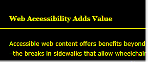
Our site contains a few pages, such as the Action Paper, where second-level headings are set apart with a background color. This provides a clear visual contrast with the default color scheme, but I discovered this distinction was not as clear in High Contrast Mode. As a solution, we decided to give these headings a white one-pixel border on the top and bottom. Because the border is white, it is usually invisible. In High Contrast Mode, the background color becomes invisible, but the borders become visible, as seen in the screenshot below:

Screenshot of heading in high contrast view

This is a new technique that I have not seen suggested elsewhere, so there might be some issues with this approach that I have not considered, but it appeared to work well in testing. Thoughts and recommendations are welcome in the comment section below.

Images with transparent backgrounds

While testing, I also noticed several images on our site with transparent backgrounds. When the background color was changed from light to dark, many of these became unreadable. For example, the GOALS logo in our sidebar originally looked like this in High Contrast:

Screenshot of a logo with a transparent background in high contrast. The text is dark gray on a black background.

As you can see, the word “GOALS” is quite difficult to read. When we replaced the transparent background with a solid background, it becomes much more readable:

Screenshot of the same logo with a light background

This change was implemented to several other images throughout the site.

While this approach makes content more readable in High Contrast Mode, images with transparent backgrounds still have their place. If the background has a gradient or texture, the use of a transparent background is necessary. Images with transparent backgrounds may also be the best choice when giving your logo to a third party for use on their website, printed materials, etc.

Try it yourself

Testing in Windows High Contrast Mode is quick and easy (assuming you have access to a Windows computer), and it may reveal a few surprises, as it did on this site. These settings are accessed in different ways depending on the version of your operating system, but I have found the easiest way to access these settings in Windows 7 is to simply press the Windows key to open the search and type “contrast” into the field. The first option that appears should be “Turn High Contrast on or off.” You may need to restart your browser or refresh an open window once High Contrast is enabled. Use Internet Explorer for the most reliable results and be aware that some content, such as an all-black logo with a transparent background and many CSS background images, can disappear completely. I highly recommend that you take the time to test High Contrast on your own site.