GOALS ‘Cheatsheets’ Update—Now with (Two) Videos!

Over the last few years, the GOALS project has developed a number of single-page resources on popular topics like creating content in Microsoft Office or captioning files in YouTube. Although we know these resources do not replace more comprehensive articles or training (which is why we named them “cheatsheets”), response to them has been very favorable and they have been used to fill a number of roles at several higher ed institutions. For example, they have been used as just-in-time resources for people who may not have the time or interest to seek out more information, as handouts in trainings, or as a refresher for people who have learned about these principles in the past.

We are happy to announce some new additions to this suite of resources. First, in June we added cheatsheets for MS Word 2013 and PowerPoint 2013 for Windows. Second, we have created video companions for two of our resources—Acrobat XI (published in May), and Captioning in YouTube (released today). While we probably do not have the resources to develop videos for all of our cheatsheets, we hope these videos will be useful. We may even create additional videos in the future.

We are committed to keeping these cheatsheets up to date, and plan on creating more resources  into the future. If you have ideas for additional cheatsheets or videos, or any recommendations at all, please let us know in the comments below.

Announcing the GOALS Email Discussion List

Update: This discussion list is no longer active

As the number of institutions participating in the GOALS project continues to increase, we have steadily been building resources. We now feel that this is a good time to launch an email discussion list. This list will be a place for GOALS project participants and other interested parties to share questions, experiences, and recommendations on system-level web accessibility implementation efforts (e.g., policy creation, supporting faculty and staff, etc.).

While we don’t anticipate issues, we appreciate your patience if there are any snags. There may be a flurry of activity (or inactivity) as we get things going, but we expect the list to stabilize in a couple weeks. Please contact us if you have any questions or identify a problem.

We hope you will subscribe and share your experiences.

Presentation Template: Making the Case for Web Accessibility

We have had several requests from folks who would like help creating content they could use as they work to obtain buy-in from others at their institution (e.g., Administrative decision makers, faculty and staff).  The PowerPoint file below is one complete presentation that was used for this purpose.  Feel free to use all or some of this content as you work to create something that will resonate with your own audience.

Please do make sure to keep the GOALS attribution (last slide) intact. Also, please let us know how you are obtaining buy-in, as we would love to share your successes, and methods, with others.  If you modify this presentation we would love to see how your final materials speak to your own audience. It may help someone else think through this critical step to get web accessibility work started at their own institution.

How to Use our Accessibility Cheatsheets

Over the past year or so, GOALS has been developing a series of cheatsheets to help faculty, staff, and other content creators produce more accessible content. Response to these sheets has been extremely positive and we plan to continually update these resources as new techniques and technologies become available. We have recently reorganized our main cheatsheet page by type of technology (instead of date published) and have just created a new cheatsheet for Acrobat XI.

As the popularity of these resources continues to grow, we wanted to take a minute to cover how we believe these resources should (and should not) be used.

During my first year of college I had a professor who took great pride in his difficult tests. However, he did allow one single-sided sheet of handwritten notes. I remember spending a tremendous amount of time copying text in the tiniest size I could manage until I was confident the sheet contained every bit of possible information. I’m sure most of you can guess the outcome—I spent most of my time looking up every answer and struggled to finish the test before time ran out. During the next test I filled the sheet with about a third as much information, things like unfamiliar names and specific dates. I trusted in my familiarity with the concepts and used the notes to help recall details, and did much better.

While developing the GOALS cheatsheets we have the same rule—each resource must fit on a single printed page. We almost always have to cut information that we would like to include, but we feel this design decision is part of what makes these resources helpful. They may not provide all the information (the Adobe guide to Acrobat XI accessibility is a 90+ page PDF), but they provide essential information that people are likely to forget or overlook.

Just as a real life cheatsheet won’t get you a good grade on a topic you have never studied, our accessibility cheatsheets will probably not provide enough information for users who are completely unfamiliar with accessibility (even though we know they are sometimes used this way). We have found that they are very useful as handouts at a face-to-face training or as downloadable resources on a support page with additional tutorials. Hopefully they can fill a similar role at your institution.

Learning to Love Headings in Microsoft Word

An institutional commitment to accessible online content must start with the content creators. At most institutions, content usually starts with Microsoft Word. While there are several things content creators can do to improve the accessibility of Word documents for individuals with disabilities (see our cheatsheets on Word for Windows and Word for Mac for specific examples), I am convinced that the single most important thing that they can do to enhance the accessibility of their documents is to start using true headings in Word (headings that appear in the Styles ribbon). In most documents sighted users rely on headings to scan through the document and navigate to relevant sections. Using true headings provides this same functionality to many users with disabilities, especially those who are blind. However, this can be quite an adjustment for someone who is used to creating headings by selecting text and making it bigger, bolder, underlined, centered, etc.

Below I offer a few reasons why using true headings will make life easier not just for individuals with disabilities, but for you, the document creator.

It is faster

It usually takes at least three steps to create false headings: change the text size, add bold or italics (or both), and select a different font. Adding a true heading is much simpler—just select the correct button from the Styles ribbon at the top of the page.

Screenshot of the Styles panel in Word for Windows. Options for Heading 1 and Heading 2 are visible.

If you are a person who likes to use keyboard shortcuts, you can also create heading levels 1-3 by pressing Ctrl + Alt + 1, 2, or 3 (command + option on a Mac). Once this shortcut becomes habit it can save a considerable amount of time.

Changing visual styling is straightforward

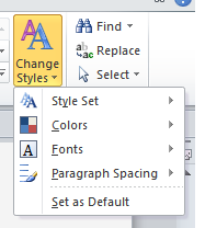
The number one complaint I hear from people who choose not to use true headings is that they are ugly or too confining.  While this can be true, changing the appearance of these headings is not as difficult as some may fear. There are two main ways to change the visual style of a page. First, you can change the appearance of the entire document with the Change Styles option on the right-hand side of the Styles ribbon:

Screenshot of the Change Styles option in Word for Windows

Second, if you would rather tweak the appearance of an individual heading level (e.g., you would like your h2s to be italicized), you can accomplish this in Windows by right clicking on a specific heading in the Styles ribbon and selecting Modify. You can even do the reverse—select a block of text that has been styled correctly, right-click the desired heading in the ribbon and choose Update [your heading] to Match Selection. On a Mac you would select the icon to the right of the Styles menu with hover text of “Manage the styles used in this document.” This enables you to modify any part of your heading to achieve the style you desire.

Screenshot of the Manage Styles option

While it does take a while to learn your way around these different options, it becomes a tremendous time saver.

Creating a Table of Contents is simple

If a document has a correct heading structure, Word can also create a table of contents for you based on the document’s heading structure. In Windows, go to the References tab and select Table of Contents. On a Mac, select the Document Elements tab and then you can directly select the Table of Contents in the format you would like it to appear.

Screenshot of the table of contenst options in Word for Mac.

You can also customize the table of contents to change its appearance or choose which heading levels will appear (e.g., Heading levels 1-3). If you make changes to the document that affects page numbers within the table of contents, you can always go back to it and choose Update.

The document is easier to create and to read

There’s a reason your 5th grade teacher taught you to start your essay by creating an outline. Documents that include headings from the start tend to be more consistent in their structure, easier to follow, and even better written. Your readers will be able to read and navigate your pages more efficiently if they can come to expect a consistent heading structure, and I am convinced that you will find it easier to write the document as well.

Accessibility Video “Playlist”

Video can often convey emotion and information more effectively than a static article. It can be an engaging way to start a presentation or to demonstrate a complex task. However, finding the best video for a certain topic can often be very time consuming (trust me!). While there are many great videos online, many of the videos on this topic present misinformation (e.g., the wrong way to add alternative text in MS Word) or are presented without captions themselves.

This post includes links to the most accurate, engaging, and accessible videos that I could find after hours of searching. Unless specified otherwise, videos are captioned and are found in YouTube.

Experiences of users with disabilities

People are far more inclined to make their content accessible once they realize how their design decisions can help real people with disabilities. If you only have time to share one video, make it a firsthand account from a user with a disability.

A Personal Look at Accessibility in Higher Education

Created by GOALS

Students and faculty with disabilities share their frustrations with inaccessible web content in higher ed as well as their optimism that things can improve.

Keeping Web Accessibility in Mind

Created by WebAIM

Three users with disabilities (blindness, quadriplegia, deafness) demonstrate their frustrations with inaccessible web content. The technology used is a bit dated, but the experiences are very relevant.

To Care and Comply

Created by

The first half of this video (especially the first minute) provides excellent examples of students and faculty with disabilities.

World Wide Access

Created by DO-IT

This is a fabulous resource for web developers and other more technical individuals. It explains the four principles of accessibility that form the foundation of the Web Content Accessibility Guidelines (WCAG) 2.0. It has dozens of examples of users with disabilities interacting with web pages, and uses audio descriptions, which may be new to some viewers.

How Blind People Use The iPhone 4S

Created by Tommy Edison

The always humorous Tommy Edison shows how he uses an iPhone. After watching this video, take a few minutes to watch one of his Blind Film Critic videos.

The importance of accessibility

While many people may think it is a noble goal, they may not be sold on the importance or value of accessible web design. These videos help outline why web accessibility is a smart, fiscally responsible decision.

Web Accessibility

Created by FaHCSIA (the Australian Government Department of Families, Housing, Community Services and Indigenous Affairs)

An engaging, jazzy (maybe too jazzy) introduction to web accessibility. While the references and statistics refer to Australia, the principles are universal.

IT Accessibility: What Campus Leaders Have to Say

Created by DO-IT

While a bit long, this video provides a very compelling case for accessibility from Administrators in higher education. If you are struggling to win over administrators at your institution, this is a must-watch.

Creating accessible content

I had a great deal of difficulty finding tutorial videos that were accurate as well as timely.

Accessible Documents in MS Office (no captions)

Created by Microsoft Office

Although this video is not captioned, it was the most accurate and up to date video I could find. Many of the best videos for creating accessible content are provided by the company itself.

Create Accessible PDF Files in Acrobat XI (Adobe site)

Created by Adobe

A brief overview of how to use the “Make Accessible” wizard in Adobe XI. Adobe has an excellent “Accessibility Channel” for many of their tools. Unfortunately, not all of these videos are captioned.

Caption Fail

Created by Rhett and Link (no captions)

Do you know someone who thinks that YouTube’s “Automatic Captions” are the answer to their captioning problems? Show them this humorous video. Ironically, I was unable to find a good video on captioning YouTube videos.

What’s on your playlist?

Is there a video that you regularly use that isn’t on this list? Please share it below.

Web Accessibility Law in Higher Education

I am often asked by people if their institution has a legal obligation to provide web content that is accessible to individuals with disabilities. The short answer to this question is yes, but sometimes there is confusion regarding which laws apply to a specific institution. This post provides a quick glance at the three most significant laws regarding web accessibility in higher education–Section 508, The Americans with Disabilities Act (ADA), and Section 504.

The information provided here should not be inferred to be legal advice. Anyone questioning legal obligations for their organization should consult with an attorney.

Section 504

Section 504 of the Rehabilitation Act of 1973 is the first civil rights legislation in the United States designed to protect individuals with disabilities. It is often the last of these three laws to be mentioned, which is unfortunate because it is probably the most unambiguous of the three. It clearly states:

“No otherwise qualified individual with a disability in the United States… shall, solely by reason of her or his disability, be excluded from participation in, be denied the benefits of, or be subjected to discrimination under any program or activity receiving Federal financial assistance.”

In other words, if you receive federal funds, you cannot discriminate based on a disability.

Americans with Disabilities Act

The Americans with Disabilities Act of 1990 is a sweeping piece of civil rights legislation that prohibits discrimination based on disability within employment (Title I), state and local governments (Title II), and public and commercial facilities (Title III).  Because it became law in 1990, when the web was in its infancy, it does not actually mention the internet at all, but there are still ways that the ADA applies. Title II applies to state and local government, including public institutions of higher ed. It clearly states that communications with persons with disabilities must be “as effective as communications with others.”  This is commonly interpreted to include web content. The Office of Civil Rights has defined effectiveness to include 3 components (OCR 09-97-2002.RES): (a) the timeliness of delivery, (b) the accuracy of the translation, and (c) provision in a manner and medium appropriate to the significance of the message and the abilities of the individual with the disability. You can see how providing an after-the-fact accommodation of the accessibility of a few limited pages of course materials could violate this provision.

Title III, however, is a bit foggier. There have been many lawsuits to determine how the web is included in ADA and the outcomes have been mixed. The Department of Justice (DOJ) is currently working to clarify this. In 2010, they published an Advanced Notice of Proposed Rulemaking (ANPRM) to revise Title III of the ADA to include websites. Under the section regarding the “Legal foundation for Web accessibility,” an entire paragraph is devoted to the internet and education:

“Beyond goods and services, information available on the Internet has become a gateway to education. Schools at all levels are increasingly offering programs and classroom instruction through websites. Many colleges and universities offer degree programs online; some universities exist exclusively on the Internet. Even if they do not offer degree programs online, most colleges and universities today rely on websites and other Internet-related technologies in the application process for prospective students, for housing eligibility and on-campus living assignments, course registration, assignments and discussion groups, and for a wide variety of administrative and logistical functions in which students and staff must participate.”

The DOJ has not provided any update on this ANPRM, but indicted that they will do so in 2013.

Section 508

Section 508 of the Rehabilitation Act, as amended in 1998, is US law that applies to Electronic and Information Technologies within the US Federal Government. While the scope of Section 508 is only within the US federal government, it may still impact your institution for several reasons:

  • It is currently the only place in US law that defines what constitutes web accessibility, so its standards may be used to determine accessibility by vendors who desire to conform to this provision and also in legal actions. This is not an endorsement of Section 508 and careful consideration should be made when choosing a technical standard for your institution.
  • Some states (e.g., Arizona, Nebraska, Oklahoma, Wisconsin) have adopted Section 508, or a derivative, as state law, applying to state agencies.  In some states, Higher Education is part of the state agency constellation.
  • Many grants and other sources of federal funding require that materials created within the funding meet 508 standards (§1194.22 for web content).

Let’s Recap

  • Section 504
    • Yes, because basically all institutions of higher ed receive federal funds.
  • ADA
    • For public institutions, yes.
    • For private institutions, currently being clarified.
  • Section 508
    • Section 508 as a law applies to Federal Government.
    • Many grants and contracts with the government require that materials that are created meet Section 508 standards.

So is it really the law?

In 2010, the following statement was issued by the Department of Justice:

“There is no doubt that the Internet sites of state and local government entities are covered by Title II of the ADA. Similarly, there is no doubt that the websites of recipients of federal financial assistance are covered by Section 504 of the Rehabilitation Act. The Department of Justice has affirmed the application of these statutes to Internet sites…in numerous agreements with state and local governments and recipients of federal financial assistance.”

This statement leaves little room for interpretation. So my response to the question, “Does my institution have a legal obligation to provide web content that is accessible to individuals with disabilities?” is “Yes”. Both public and private institutions (that receive federal funds) have a legal obligation to create accessible web content.

Choosing a Technical Web Accessibility Standard

In the path toward improved web accessibility, one of the most important steps is the creation of an accessibility policy, and at the heart of an accessibility policy is a technical accessibility standard. This technical standard outlines the minimal level of accessibility for the web content that your group will create and purchase.

Choosing a standard seems simple, but reaching a consensus on a standard can be difficult. Aim too high and there can be resistance and non-conformance. Aim too low and accessibility will be insufficient and discrimination might still be an issue. When choosing a standard, there are really only two places to look—Section 508 and WCAG 2.0. There are pros and cons to each. The following blog post addresses some of these pros and cons, and provides our recommendations for an accessibility standard.

Section 508

As law, Section 508 applies to branches of the US federal government, but other groups commonly use its technical standard as well, including state governments and businesses.

Section 508 Pros:

  • It is used by many organizations, so it is easy to find and purchase resources that claim compliance with 508.
  • There are currently only 16 checkpoints for web content, making conformance easier than other standards.
  • 508 applies to “Electronic and Information Technology” (e.g., software, computers, etc.), not just web content.
  • It is more concrete and prescriptive in its language.

Section 508 Cons:

  • It is very dated. The standards are over a decade old and they are based on WCAG 1.0, which is even older.
  •  It is insufficient. Many of the checkpoints are dated or redundant, leaving you with a very small list of relevant recommendations.
  • It is being updated, making it a bit of a moving target.

Section 508 Refresh

Section 508 has been undergoing a “refresh” for years now. Although the date that 508 will be updated is uncertain, two separate drafts have been presented for public comment, most recently in December 2011. While the draft could change further still, one thing is clear—the refresh version of 508 will be more inclusive and complicated. If you choose Section 508 as a technical standard, be ready for it to change dramatically and anticipate this change in your accessibility policy.

WCAG 2.0

The Web Content Accessibility Guidelines (WCAG) 2.0 is a set of international guidelines for web accessibility developed by the W3C. They were finalized in December 2008. The guidelines are organized by levels (A, AA, AAA).

WCAG pros:

  • It is the most complete and up-to-date set of accessibility guidelines.
  • It is the basis of a most international accessibility law.
  • An increasing number of vendors provide information about WCAG 2.0 conformance.
  • It aligns very closely with the proposed 508 refresh. In fact, meeting WCAG A and AA will probably satisfy Section 508 requirements for web content.

WCAG cons:

  • It is limited to web content.
  • There can be a gap between Level A (which may be insufficient) and AA (which can be difficult to implement). However, even Level A is more relevant than current Section 508.
  • It can be a bit difficult to interpret.

What about a WCAG A/AA hybrid?

If Section 508 is dated and WCAG AA can be difficult, then wouldn’t a hybrid standard be the ideal solution? While this may seem like an ideal compromise, hybrid solutions have one significant drawback—vendors typically do not make products for locally derived hybrids so you may find it very difficult to find resources and purchase products to meet your standard. Part of the intent of a widely used standard is to help harmonize the field, and provide interoperability.

While we do not typically recommend a hybrid standard, there is at least one instance where it may be warranted. If your institution is determined to choose a less-inclusive standard such as WCAG 2.0 Level A, you could at least enhance it with additional standards (e.g., Level AA criteria for visible keyboard focus and color contrast).

Our recommendation

While a technical standard should reflect your institution’s specific needs, some standards are better than others. We typically recommend a standard in the following order:

  • WCAG 2.0 Level AA.
  • Section 508, with the proviso that the standard will be updated when Section 508 is updated. If this is your institution’s approach, refer to WCAG as an intermediate solution. This will prepare your institution for the transition to the refreshed 508.
  • If your institution determines that WCAG AA is too burdensome and 508 too uncertain, a minimal recommendation would be WCAG Level A, or possibly a hybrid standard as outlined above.
  • Choosing Section 508 without addressing the update is not a sufficient standard for any organization.

No matter what you choose, you will want to be explicit as to your technical standard.  It should appear in your policy statements and be referenced in procurement contracts and training plans. Hopefully this review provides your institution with some guidance for this important step. If you have additional thoughts or recommendations, or if you disagree with our recommendations, please comment below.

Common Web Accessibility Issues in Higher Ed

As part of my efforts with GOALS, as well as my work with WebAIM (a partner), I have had the opportunity to evaluate the accessibility of many websites across business, education and government. While certain issues, such as missing or inappropriate alternative text, seem to be common on many websites, I have noticed that some accessibility issues seem to be more frequent in Higher Ed. The following post outlines five of these issues, why I feel they are more common, and what can be done to address them.

Color contrast

Text with higher contrast is typically more readable, especially for individuals with certain visual and cognitive disabilities. While the web is full of text that would benefit from better contrast, this issue is much more common in Higher Ed. The reason that contrast issues are more common is simple—school colors are central to most college and university websites, and these colors were not chosen with contrast in mind. Creating a site design with sufficient contrast can be very difficult, especially with colors such as red and orange. Here are a few principles to keep in mind:

  • Larger text does not need as much color contrast. If you have a lighter school color, use it in headings, not in link or body text.
  • If your school color is too light to use with a white background, see how it looks with a darker background. This might work especially well in a banner or menu at the top of the page, or in a footer.
  • If a link is not underlined, there are only a small number of link colors that provide sufficient contrast between the main text and link text, and between the link text and background. The easiest way to address this is to underline your links.

Carousels

College and university websites must cater to a diverse range of people including students and prospective students, faculty and staff, alumni, and members of the community. One way that many institutions try to reach all these groups is by providing a carousel on the homepage. A carousel is a section of the page that rotates through a series of images or content, usually automatically. The vast majority of Higher Ed websites have these. While carousels usually pose significant accessibility issues, it is possible to create an accessible carousel. Here are a few principles to keep in mind:

  • It must be accessible using only a keyboard.
  • Users must be able to pause and resume the carousel.
  • The information contained in the carousel must be readable by screen readers.
  • It needs to be designed so that the user will not encounter problems if they are in the carousel when it updates.

Multiple templates and layouts

Many postsecondary institutions are composed of independent colleges and departments, and many of these groups like to show their independence with a unique web design. It is not uncommon to encounter dozens of different templates on a single institutional website, but with each unique layout comes unique accessibility issues. This is compounded by the high turnover at many schools (student employees are often used to design and maintain web content).

While it might be possible to address this issue through training, we have found that institutions with a more unified design tend to be more accessible. Reining in a highly decentralized school can be difficult. We are housed at Utah State University, which has been working on this issue for a few years. We know firsthand the frustration that comes from having certain design limitations imposed on our work, but from an accessibility and usability standpoint, the benefits are worth the frustration.

Reliance on an LMS/CMS

While Content Management Systems are fairly common on the web, Learning Management Systems (LMSs) are even more ubiquitous—they can be found at almost every postsecondary institution. LMSs allow individuals with limited technical expertise to create courses and post other content online. This can be tremendously helpful, but it can be very difficult or even impossible for students to access content in an inaccessible LMS.

While we do not endorse a specific LMS, we have found several LMSs are constantly improving their accessibility, probably because of feedback from their customers. If you are in a position to influence your institution’s choice of LMS, ensure that accessibility is part of the selection process and that it is written into any requirements, documents or contracts.

Non-HTML files

HTML content is typically more accessible than non-HTML content. It is also easier to evaluate and repair. Unfortunately, Higher Ed websites are often full of non-HTML content such as PDF, Microsoft Word, and PowerPoint files. This is probably due to the fact that much of the content on an institutional website is created by faculty and staff who are much more comfortable and familiar with these tools.

While it would be ideal to see more HTML content on these websites, the reality is that many sites will continue to rely on non-HTML files for a great deal of their content. The next best solution is to provide training and technical support for faculty and staff that will be using these programs. We have found that the foundations of creating accessible Word, PowerPoint and PDF files can usually be taught in an hour or so. If training is not available, we have developed a series of accessibility cheat sheets that provide a brief overview on creating accessible Word, PowerPoint and PDF files, as well as the best ways to convert office files to accessible PDF. We will continue to develop new cheat sheets and hope these resources can provide support for non-technical content developers.

Accessibility “Cheat Sheets”

GOALS has created a new set of resources, or “cheat sheets” to help assist individuals in the quest to create accessible content. GOALS currently has four cheat sheets available, addressing the following topics:

  • Creating accessible documents in Microsoft Word
  • Microsoft PowerPoint
  • PDF conversion in Microsoft Word
  • Creating accessible PDF documents in Acrobat X

Each resource is a single page, and is intended to be printed.

View the cheat sheets (PDF) 

We plan on presenting more resources soon, including a handout on captioning within YouTube.